The ESA page includes a series of maps, including this movie with methane concentrations. As far as I can see this map/movie set is ok:

ESA methane data movie, top of the page,
all data is shown
There's also a short movie near the bottom, which includes an interesting edit. I'm copying here:

ESA methane data movie, bottom of the page,
some areas are masked
some areas are masked
The movie moves a bit too fast, so I decided to take a few screen prints which follow. Notice how the third map shows grey areas where previous maps show yellow and orange high methane concentrations? I wonder, why would they take the same data set and mask key areas they show at the top?
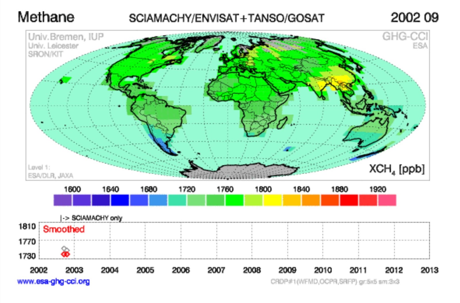

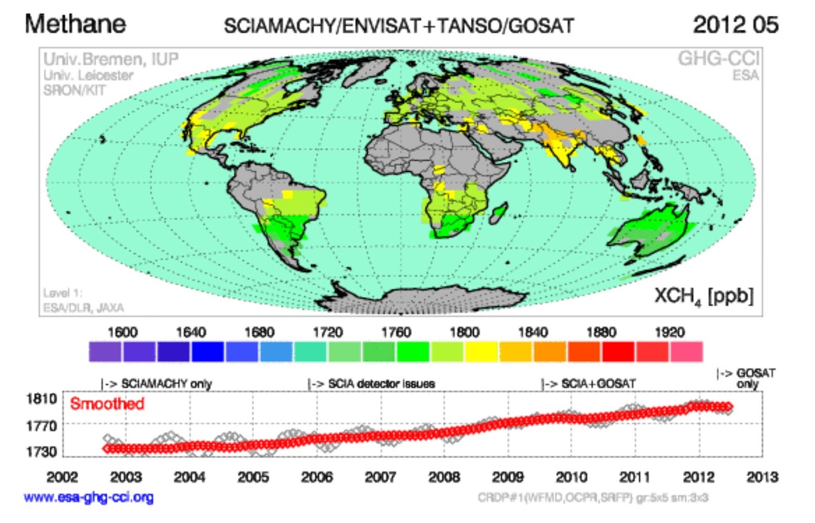
I was somewhat surprised to see the high methane concentration areas in the China-India-Africa belt, which was quite visible in the early years, has been masked out in recent years. This means a new series of maps and a movie would have to be made with the full data set. I guess I'll have to remain in the dark about methane emission sources until such a map set can be generated.
No hay comentarios:
Publicar un comentario